Styling and Profiling: My CSS Therapy Session
Having fun with CSS
Most people watch television, read a book, or perhaps go for a hike to unwind and escape daily life. I, on the other hand, like to play with stylesheets. Working on the functionality of my sites is a main priority, but it can be stressful at times, making the code play together well. It requires quite a bit of concentration to get things working smoothly. So, I like to unwind in style.
Don't get me wrong;UX/UI is not my strong suit by any means, and I'm not downplaying the work of front-end developers and designers. However, it’s easy and relaxing to simply mix and match colors, adjust contrasts, and tweak HTML output. For the better part of the last two weeks, I’ve been experimenting not only with the front-end styling of this site but also with making the admin area easier on the eyes.
Hero Image
For the last two days, I’ve been beating my head against a wall trying to figure out how to get this website’s homepage to load faster on mobile devices. My PageSpeed Insights scores are 100 across the board on desktop;the site loads like a lightning bolt. But on mobile, I’m getting a 3200 ms render delay for the hero image.
Previously, I loaded the hero image as a div background in my stylesheet, and it was doing okay. Then, I introduced a new font as an overlay, and that seems to have slowed the render time. I opted to locally host three fonts: Orbitron for headings, Rajdhani for the menu, and Inter for body text.
I tried moving the hero image into a <picture> tag and used the mobile version as a fallback <img>. I’m also preloading the mobile-sized image along with the Orbitron and Rajdhani fonts, as they are used above the fold. Still, the site was taking over four seconds to load on mobile.
To address this, I split my main CSS file, which was approaching 2000 lines, into two files: main.css for critical styles and newstyle.css for just about everything else. My header.php file is already pretty chunky with all the PHP for SEO related items, running the site, so I didn’t want to introduce the 400 lines of CSS needed for the critical styles directly into it. Instead, I preloaded main.css. This reduced the load time to 3.8 seconds.
Update: I backtracked here because, on mobile devices, the main.css would sometimes still cause a layout shift. So, I bit the bullet and included the critical CSS directly in the header file.
The hero images have all been converted to WebP format, and the mobile version is only 14 KB, so size isn’t the issue. At this point, I might be overthinking it. When I clear my cache on my personal phone, the site loads instantly. I’m even considering removing the hero image entirely, as doing so bumps the site’s mobile scores to 100 across the board. The only reason I don’t is that I really like the image. So, for now, it stays.
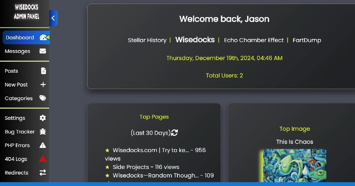
Admin Panel
The admin panel has gotten the most attention. It’s much more responsive on mobile now, which is great;though not strictly necessary yet. However, it will come in handy down the road when I use this admin panel on other websites that might have multiple users to account for.
I reworked most of the CSS for the admin panel, adding fancy gradients and introducing icons in many areas. In fact, the main reason I started working on the front-end styles was that the admin panel started looking better than the actual website. Honestly, it still does;at least for now. I love the dark background theme, but I may have gone a bit too dark. It doesn’t look nearly as good on mobile devices, as the contrast between colors isn’t as strong as it is on a larger screen. I’m working on it, though.
About two-thirds of my traffic comes from desktops. I figured this would be the case when I revamped the site to focus primarily on blogging. Let’s be real;how many people read blogs on their phones? Most people glued to their phones need video content shoved down their throats and can’t (or won’t) digest long-form text like blogs. I know this might change over time, so I’m still working on how the site renders on mobile. If not for the users, I’m doing it for search engines;because they index the site with mobile-first in mind.
So, if this site looks good on your phone, just know I didn’t do it for you. I did it for Big Daddy Google.